Isopleth Map:
This map shows the amount of people who died in California from the H1N1 virus, which is also known as Swine Flu. The majority of deaths that occurred were in Southern California towards the Los Angeles area which is heavily populated.

Population Density Map:
This population density map shows the growth in population of each county in the United States. From the map, you can see that New York's population is projected to decrease. The blue shows a decrease whereas the orange shows increases in population.

Chloropleth Map
This chloropleth map shows how much purchasing power each country has in relation to US dollars. From the map you can see that US, Europe, and Asia hold the majority of purchasing power in the world.

Dot Density Map:
This dot density map shows where the majority of people in China live by the use of dots. As you can see, many of the people live on the coast, which is interesting.

Topographic Map:
This map shows the Floridian Aquifer system. The topographic lines show the thickness in feet of how deep the aquifers are in Florida. The blue shows the thicker aquifer and the lighter colors shows where the aquifer isn't as thick or deep.

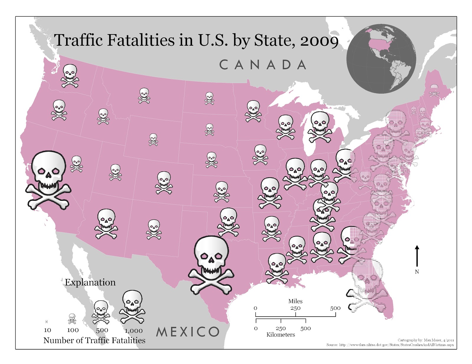
Proportional Symbol Map:
This map shows the amount of people killed in traffic accidents in the United States in 2009. The bigger the scull, the more fatalities. California and Texas had the most fatalities, but that could also be due to their large populations.
Hurricane Leslie:
This is the projected path for Hurricane Leslie, which is in the Atlantic Ocean right now.

No comments:
Post a Comment